How To Take Insta-Worthy Makeup Shots Like A Professional Beauty Blogger
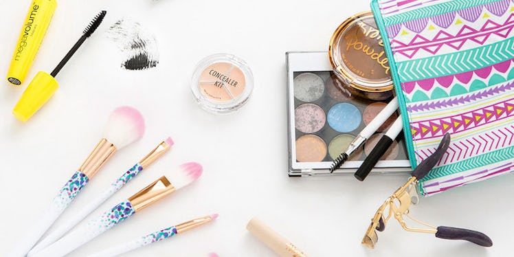
If you've browsed any beauty blogger's Instagram feed, you've probably noticed those majorly artistic layouts of beauty products that look like they fell perfectly into place.
Well, guess what? They didn't. In fact, those layouts are called "flat lays" (a little insider terminology), and they actually take some expertise to master. So, we decided to go ahead and share some pro tips for how you can take these types of images to a whole new level.
Watch out, Instagram, here comes a whole new wave of talented beauty babes!

1. Work in a square.
Obviously, if you're working with another crop shape, then go with that layout instead. The idea here is that you keep your work space in alignment with the crop your image will be.
2. Pick a color palette.
There really are no specific rules as to what color scheme is best. The important thing is to be mindful of how your colors play off one another and where they are throughout your layout. If you have a brightly colored item on the lower right quadrant of the layout, try balancing it with another pop of color near the upper left.
3. Angles are your friend.
If you can, conceptualize this image without any angles — super boring, right? Angles are a great way to get creative and utilize your space in an artistic, visually pleasing way.
4. Choose balance over symmetry.
You can't expect to have a symmetrical space when you're dealing with multiple shapes and sizes of products. Rather than fight a losing battle, embrace it and aim to create balance. Pay attention to the negative (background) space. Keep that space fairly consistent between each product.
Also, when you have a group of large products on one side, be mindful of what you place on the other quadrants of space. If you want to have a balanced sense of “weight,” you can counter-balance larger products by strategically structuring the negative space between smaller products.
5. Group similar products.
This may not always apply, depending on the type of layout you're working on, but if you have more than a few of the same type of product, the visual will translate best if you keep them grouped together.
6. Create squiggles and shapes.
Use the products to fill in spaces that aren't looking quite right. For example, in the layout below, I couldn't get the lower half to feel balanced, so I opened up the eyeliner and drew on some dots and squiggles to take up more space, which also looks super cute in the image!

Remember, this is a really basic roundup of the types of things you want to pay attention to when creating your flat lays. You'll naturally learn more as you play around with them. Next-level details — including things like lighting, shadows and highlights — will come in time.
Don't worry, you'll get there! Have fun and get creative.