"Living Coral" Is Pantone's New Color Of The Year & Here's The Interesting Reason It Was Chosen
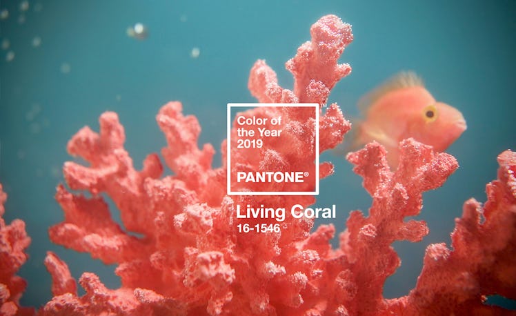
Every December, Pantone, the experts in color, select a certain hue to represent the upcoming year based on trend analysis and social and cultural shifts. For 2018, it was Ultra Violet and today it was revealed that Pantone's 2019 Color of the Year is a gorgeous and cheery shade called Living Coral. Described as "An animating and life-affirming coral hue with a golden undertone that energizes and enlivens with a softer edge," on Pantone's website, it's a bright prediction for the year to come.
Even more than that color itself, I always find the reasoning behind its selection incredibly interesting, as it's a reflection of what's going on socially and culturally and is influenced by trends across all industries. It's meant to influence design trends for the upcoming year while referencing the current state of things, and therefore holds way more depth than simply being a de rigeur hue. "To arrive at the selection each year, Pantone’s color experts at the Pantone Color Institute comb the world looking for new color influences," the company explains on its website. "This can include the entertainment industry and films in production, traveling art collections and new artists, fashion, all areas of design, popular travel destinations, as well as new lifestyles, playstyles, and socio-economic conditions. Influences may also stem from new technologies, materials, textures, and effects that impact color, relevant social media platforms and even upcoming sporting events that capture worldwide attention."
Tech has played a huge role in the selection of the colors for the past couple of years and this year is no different. Living Coral is meant to serve as a reprieve of sorts from social media and digital technology and represent a place of refuge, somewhere bright, lighthearted, intimate, and joyful. "Vibrant, yet mellow PANTONE 16-1546 Living Coral embraces us with warmth and nourishment to provide comfort and buoyancy in our continually shifting environment," explains Pantone. "Representing the fusion of modern life, PANTONE Living Coral is a nurturing color that appears in our natural surroundings and at the same time, displays a lively presence within social media."
In other words, it's meant to represent harmony before the digital world and the natural one—a theme that I believe is growing increasingly important as we continue to innovate at intense speeds. Just looking at Living Coral makes me feel energized and optimistic and conjures images of the ocean and its beautiful reefs to mind. Although I'm not sure if it was intentional, the color also makes me think of how our coral reefs, one of the most diverse ecosystems on the planet, are dying out due to various human activities. It's time we step back from the computer and up to nature and learn how to proceed more responsibly, don't you think?
It will certainly be interesting to see how the color will manifest both on our screens and off within the coming year. I, for one, am excited at the prospect of coral-saturated collections on the upcoming runways and wouldn't mind infusing my wardrobe with a healthy dose of it myself.